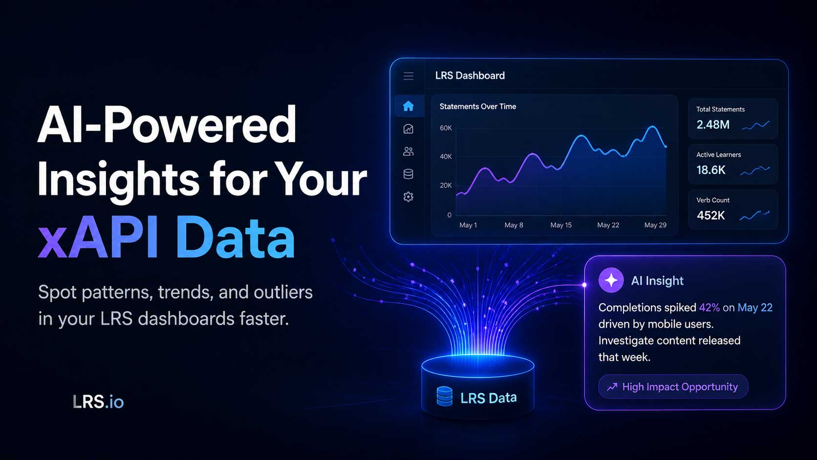
Have you ever stared at a perfectly good xAPI graph or dashboard and thought, "Now what does it actually mean?" You can see the bars, the trends, and the outliers, but turning that into a clear story for stakeholders takes time, training, and sometimes a data scientist you don't have on staff.
Veracity Learning's analytics platform (https://lrs.io) now includes a new AI Insights Assistant designed to help close that gap. With a single click, the Assistant examines any chart on your dashboard and returns a precise, written analysis for calling out the patterns, trends, and outliers it sees. It won't draw conclusions for you (that's still your call), but it will surface what a tired or skeptical human eye might miss.
Storytelling with Data
If you've ever spent time building custom dashboards over xAPI data, you've probably also started asking bigger questions: How effective is this content? Where are learners struggling? Is this program actually working? Maybe you've even built entire dashboards designed to argue a case. Data scientists often have the ability to "tell a story with the data" to weave individual charts into an overarching narrative. We recently referenced this skill and how to bring it into your LRS in our "How Do I Add 'Storytelling' to a Dashboard?" FAQ article.
Augmenting Your Team (Big or Small)
As Learning Engineering grows as a discipline, more L&D practitioners, learning scientists, and instructional designers are eager to build advanced data literacy. But those skills take years to develop and storytelling doesn't always come naturally, even to seasoned analysts. Does your team include a dedicated data scientist or analyst? The new AI Insights Assistant is built to support teams of every size:
- Small in-house training teams can use it as an "easy button" to answer questions about their data without hiring an analyst.
- Larger organizations with dedicated analytics staff can boost their team's productivity by using AI-generated observations as a starting point, or a finishing touch, that ties each chart into the wider story.
Either way, it's one more way to get measurable value out of the xAPI data you're already collecting.
A Few Things to Keep in Mind
Data quality matters. This isn't a magic bullet. The Assistant can describe what's in your data, but it can't fix bad data. As always: garbage in, garbage out. The cleaner and better the quality of your xAPI statements, the sharper the insights.
Each LRS includes 10 free credits. That's only enough to take the Assistant for a quick test drive. Need more? Contact us and schedule a requirements discussion for a quote based on your usage.
Insights take time to generate. Like most AI tools, the Assistant works in the background and may take some time (occasionally 20 minutes or more) to analyze a chart in depth. Kick off a query, get on with your day, and come back to a polished analysis ready to drop into your dashboard.
Ready to Try It?
If you're already using Veracity Learning's LRS (https://lrs.io), the AI Insights Assistant is ready and waiting. Open any of the dozens of charts in our out-of-the-box dashboards and look for the new AI Insights button. Click it, and let the Assistant do the first pass for you.
Not yet a customer? Schedule a demo and we'll show you what storytelling with AI-assisted xAPI data looks like in practice and how it could fit into your team's workflow.